Question from Maggie S.:
Hello Geek,
I have heard many, many different stories about the creation of the Apple logo? What is the true story?
Maggie
 Hi Quinn,
There are tons of stories about the inspiration behind the Apple logo. One is that the logo is a homage to Alan Turing, a man considered to be the father of computer science who died of a cyanide poisoning which may have been delivered by an apple. Other stories include references to Issac Newton and the Bible.
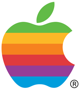
The iconic rainbow striped logo was designed by Rob Janoff in 1977. The bite was not drawn in the apple for any underlying reference or to make a statement. Instead, the bite was included on the logo so that the fruit would be recognizable as an apple and not mistaken for a cherry or a tomato.
There are various stories about the use of color in the logo. Some stories say that color was included in one of Janoff’s original design. Another is that Steve Jobs insisted on adding the color to help humanize the company. Either way, the positioning of the colors was also not deliberate. Only the green was purposely put on the top because of the leaf. When Steve Jobs returned to the company 22 years later, he traded the colorful logo for a monochromatic logo. The Apple logo has been used in many sizes and colors over the years. Still, the basic shape of the logo designed by Janoff has remained the same.
So it seems that all of the urban legends surrounding the Apple logo are untrue. The design of the logo is truly just for aesthetic reasons. There are no references or homages being made.
– TG
Ask the Geek, Get a Free Patent Mug
That’s right, if your question is chosen to be featured in our weekly “Invention Geek” column, we’ll send you a free one-of-a-kind patent mug custom pressed with a picture from your invention and the title of Honorary Invention Geek.
Got a pressing question about innovation history? Jump over to Ask the Invention Geek for details & an easy entry form!
